CSS animations make it possible to animate transitions from one CSS style configuration to another. Animations consist of two components, a style describing the CSS animation and a set of keyframes that indicate the start and end states of the animation’s style, as well as possible intermediate waypoints
HTML
Before we start writing code first, we need to create a primary structure of the HTML document, so that the browser can understand and start working. The basic HTML structure looks like the following.
After writing the primary structure of the HTML document, you will also write the tags and content you need. After that, you can see the output in your browser. We know that HTML Sudu Mae is used for exposing content in a basic format. To complete our content we need to use CSS, which is an HTML insert and it creates an engaging user interface.
<!DOCTYPE html>
<html>
<head>
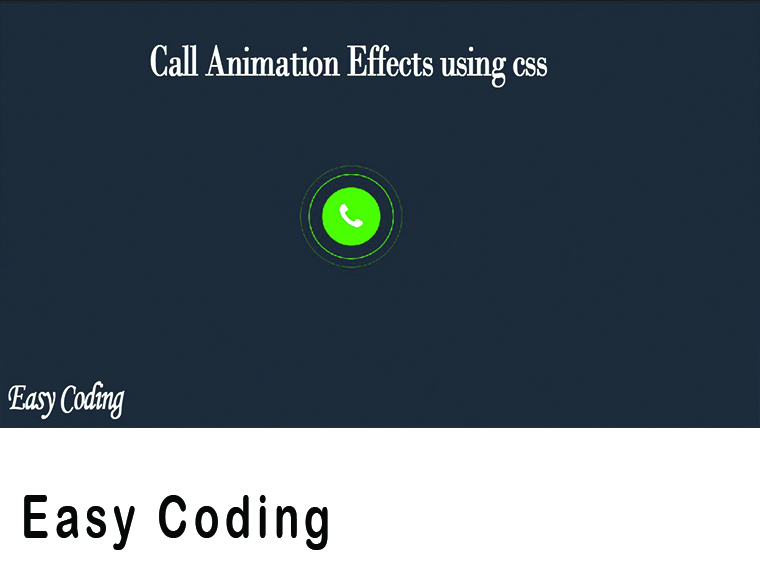
<title>call animation</title>
<link rel="stylesheet" type="text/css" href="style.css">
<link rel="stylesheet" href="https://cdnjs.cloudflare.com/ajax/libs/font-awesome/4.7.0/css/font-awesome.min.css">
</head>
<body>
<div class="contnent">
<div class="pluse">
<i class="fa fa-phone" style="font-size:50px"></i>
</div>
</div>
</body>
</html>
CSS
Now, we have time to improve the HTML content, for that, we need to add CSS to the HTML file. CSS can be added to HTML documents in a total of three ways, here we are using outside CSS design using CSS will arrive here after typing and see the output in your browser. *{
margin: 0;
padding: 0;
}
.contnent{
height: 100vh;
display: flex;
justify-content: center;
align-items: center;
background-color: #2f3640;
}
i{
color: white;
}
.pluse{
height: 100px;
width: 100px;
background-color: #44bd32;
border-radius: 50%;
display: flex;
justify-content: center;
align-items: center;
position: relative;
}
.pluse:before{
content:"";
position: absolute;
width: calc(100% + 40px);
height: calc(100% + 40px);
border-radius: 50%;
border:1px solid #44bd32;
animation:animate 1.5s linear infinite;
}
.pluse:after{
content:"";
position: absolute;
width: calc(100% + 40px);
height: calc(100% + 40px);
border-radius: 50%;
border:2px solid #44bd32;
animation:animate 1.5s linear infinite;
animation-delay: 0.4s;
}
@keyframes animate{
0%{
transform: scale(0.5);
opacity: 0;
}
50%{
transform: scale(1);
opacity: 1;
}
100%{
transform: scale(1.4);
opacity: 0;
}
}
 Reviewed by easycoding
on
August 17, 2020
Rating:
Reviewed by easycoding
on
August 17, 2020
Rating:


No comments: